

A handwritten note appearing on Keane‘s official website in March 2006 confirmed the title of their second album. The follow up to 2004’s critically acclaimed Hopes and Fears, it was to be called: Under The Iron Sea.
This monotone announcement couldn’t prepare fans for what was to come.
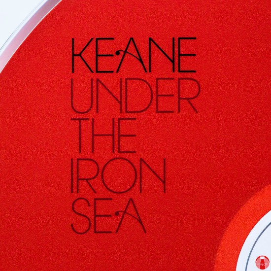
What did follow was perhaps the most revered Keane album to date, sonically; and unquestionably the most iconic Keane album to date, visually.
At the time consisting of Tom Chaplin, Tim Rice-Oxley and Richard Hughes, the band began writing for Under The Iron Sea while still touring their debut record. This period is freely mentioned as being a difficult time for the trio, largely due to the instant success and resulting fame of Hopes and Fears which featured celebrated singles: Somewhere Only We Know, Everybody’s Changing and Bedshaped.

From playing the pubs and clubs of England’s South East to opening for U2 in New York City’s Madison Square Garden in such a short space of time by industry standards, things had admittedly become a little fractured within the band.
“It [Under The Iron Sea] has a tension and energy that was entirely instinctive, born of troubles in our own lives and troubles in the wider world. Love, war, anger, fear, fame, a yearning for reconciliation, confusion… it’s all in there!
Andy Green did an incredible job of producing the album, bringing the very best out of a fractious band and pulling our disparate ideas together into a story that made perfect sense of the way we were feeling about ourselves and about the world around us.” – Tim Rice-Oxley via Keanemusic.com (14th June 2016)


Prior to the album’s release, Atlantic and Is It Any Wonder? were shared. The latter, as UTIS‘ first official single and went on to dominate the airwaves, peaking at number 3 in the UK charts as fans began to embrace this latest offering from Keane.
Practically hand in hand with the first sample of recorded music from the new record came the release of the album artwork. The impact was instant. Suddenly all of comments in the magazine articles and the insights on the internet made sense, the idea that the new record encapsulated fairy-tales and often broken ones at that.
The artwork was dramatic, intense, symbolic, mythic and importantly for all involved, the most eye-catching square on the shelf of all good record stores.

Sanna Annukka was the name behind these designs, a Brighton based artist who after a fortunate series of events was asked to create the iconic work that will forever grace UTIS’s cover. A graduate of the University of Brighton in ’05, within 12 months she had imprinted her unique visual take on the album through its artwork, aided not just by the music created but by her ever-present artistic influence from her childhood days spent in Paltaniemi, Finland, her mother’s home village.

We caught up with Sanna recently to celebrate Under The Iron Sea reaching its double figure milestone, testing her memory about the run up to its release and her side in the production of the album Keane fans have cherished for over 10 years.
Seafront: To start at the beginning, how did the collaboration between yourself and Keane begin?
Sanna Annukka: After I graduated in 2005 I started selling my screen prints at my sister-in-law’s shop in Islington, London. A friend of the band bought some of my work and so they got to know my work that way. It was serendipitous.
SF: Were you a fan of the band or knew much about them previous to collaborating?
SA: I was aware of their music yes, and particularly liked their songs Bedshaped and Somewhere Only We Know. Both stunning songs. But I didn’t know too much about them or their other music to be honest. What was fantastic was UTIS really resonated with me and the lyrics gave endless inspiration. It was a pleasure to illustrate.

SF: Had you previously drawn or imagined any of the characters which appeared in your album artwork, or were they all new for the UTIS project?
SA: Some of the characters like on the cover of Atlantic (the vinyl version) were based on previous characters inspired by Finnish folklore but on the whole, everything was new work that was birthed by listening to the lyrics.

SF: Did you ever envision your artwork being adaptable to a music release?
SA: Not at all. It wasn’t part of my plan. I was quite set on the idea of printmaking and selling my work in galleries and shops rather than go down the commercial illustration route. But it was a happy detour and one I’ll always be grateful for.
SF: After working with Keane your designs could be seen on a huge variety of merchandise, from t-shirts to bags, badges to phone charms, even on billboards and adverts throughout the world. What was it like seeing your work on such a variety of different and often unique objects?
SA: It was great to see it utilised in a way that fans were able to have memorable keepsakes in relation to the album. I think what overwhelmed me the most was seeing the large billboards. The album was widely advertised and it was a bit freaky (in a good way) seeing my work on such a massive scale!

SF: Do you have a favourite piece of UTIS merchandise or promotional material?
SA: For a period of time during the album’s promotion there was a 3-D moving version of the horses from the album cover in a music shop in London. It was cool to see the work come to life.
SF: Since UTIS you have illustrated for books based on the stories of Hans Christian Andersen, designed for stationary, posters, travel guides and expanded the materials you work with. As well as this, you’ve undergone vastly varied work for some of the world’s most well known brands (Selfridges, Apple , Marks and Spencer, etc).
Is there a dream project?
SA: I have loads of dream projects. I’ve recently become passionate about ceramics and have just set up a workshop at home to start making ceramic art panels of my work. I’m also venturing into jewellery and my own range of textiles. I love to work with new materials and see how my work transforms. So really my dream is to continue to experiment and play and push the boundaries of my work.

We also asked Keane fans from around the world to send in their questions for Sanna, a selection of which you can find below.
Patty Branchess Rice-Oxley: You’re one of my favourite illustrators and designers!! I fell in love with your work at first sight. I would like to ask about the artwork for the song Crystal Ball. Some of my friends think it is a princess, and I think it is a wizard, so I’d like know who is right, and what is the meaning of that beautiful front cover.
SA: Thank you Patty! Nice question. She’s exactly who you want her to be. But I guess I based her on the queen from Snow White (‘mirror mirror on the wall..’) To me she’s a powerful wizardess queen who can see into the future!

Marlene Martinez: What kind of background information did you have before starting to work on the project? Were you able to listen to the whole album or a song in particular for inspiration? Read the lyrics? Talk to Tim?
SA: I must’ve listened to the album hundreds of times over whilst illustrating it. I was lost in the world of UTIS for many months. Letting the melodies and lyrics influence and guide me with the artwork.
I did have a couple of meetings with the band too. This was so that we could agree on the direction it was heading. It was great to have their input. And I can confirm they are very lovely chaps!
Dries Beheydt: Did you let the songs and/or lyrics inspire the making of the artworks? And if so, how?
SA: It was entirely about the lyrics. They formed the artwork- the world that you see under the waves of the Iron Sea (in the album fold out). It was like illustrating a melancholic but beautiful fairy tale.

Marïa Räsänen: Being from Finland myself, I know the country and culture is a constant influence in your work, but did Finland play a role in the work produced during the UTIS project?
SA: My Finnish heritage is always infused in my work so yes some of the work created for UTIS, for example had a nod to Finland’s national epic, The Kalevala.
Agil Husain Abdullah: What do you think about the album itself? Do you have a favourite song?
SA: I love it. Which helped when illustrating it! I did have to have a break from listening to the album for awhile as it was on a constant loop when I was creating the artwork.
A Bad Dream is my favourite song from the album. ![]()

Songs such as A Bad Dream became the source for much of the promotional material and merchandising opportunities for the album (such as the pin badge above). Of course, this was partly the case because of its release as a single, but without question, the depth with which Sanna went into the world of UTIS and the multitude of illustrations that resurfaced, there was an endless supply of such possibilities, which has never been matched in any other Keane release.

At Seafront, we’ve collected together some of our favourite Under The Iron Sea era merchandise, some have been dotted throughout the article and the rest you can view below, just click on the image and scroll through.
We’d also love to know if you have your own piece of cherished UTIS merchandise, so get in touch!


![]()

Great article!!! Thanks for celebrating this important artwork. It truly deserves it. Greetings from Chile!
LikeLiked by 1 person
Sorry. 😦 this is my correct email address. Great article by the way. It was made with love and you can feel it.
Patty Branchess
LikeLiked by 1 person